The colour, texture, finish, and jointing all shape whether a patio feels calm and timeless or overly harsh and fussy. If you’re worried about a patio looking too new, too grey, or simply too busy, you’re not alone. The good news is that a few practical decisions early on make all the difference.
What you’ll learn
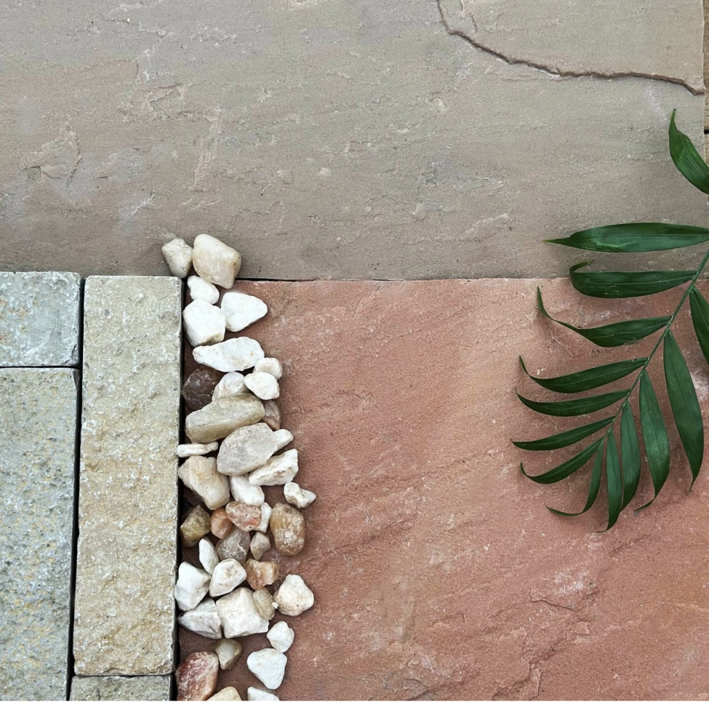
Start with your house, not the stone sample.
The best paving choices usually echo something already there: brick tones, render colour, window frames, roof tones, or the warmth of the surrounding planting. Then keep the finish and jointing simple but do consider style of jointing which can make all the difference to the way the terrace looks.
If you’re unsure, a good rule is this: choose one strong material, one calm colour direction, and let the planting do the rest.
Start with your house, not the paving display, a patio should feel connected to the house, not dropped in beside it.
Before choosing a colour, look at:
Brick tone: warm red, buff, brown, mixed, or cooler modern brick
Render colour: cream, white, taupe, grey
Window and door frames: anthracite, black, white or coloured
Roof and guttering: often overlooked, but they influence the overall palette
If your house has warm tones, very cold grey paving can feel disconnected. If your house is contemporary and crisp, heavily varied rustic paving may feel too busy.
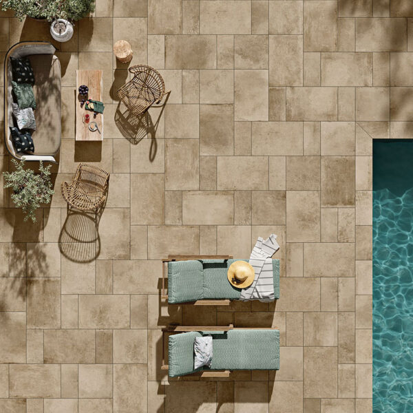
Light vs dark paving: what works best?
There isn’t one right answer, but there are trade-offs.
Lighter paving
Lighter tones can:
Make a space feel bigger and brighter
Work beautifully in smaller gardens
Feel softer and more relaxed
Watch-outs:
Can show dirt, leaf marks, and algae more quickly in shaded areas
Very pale tones can feel stark if they don’t relate to the house
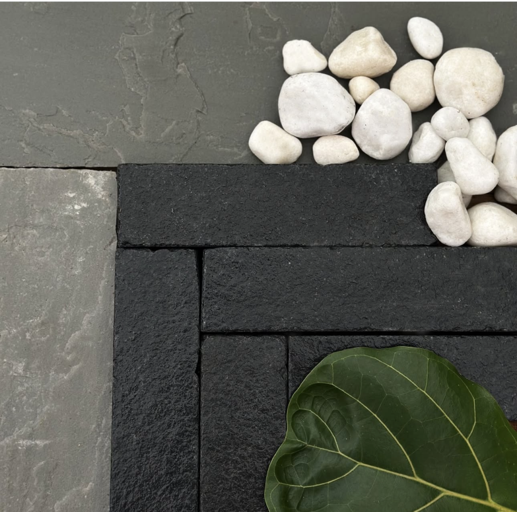
Darker paving
Darker tones can:
Feel grounded, smart, and contemporary
Pair well with modern frames and strong architecture
Help furniture and planting stand out
Watch-outs:
Can make smaller spaces feel heavier
May show dust, footprints, or lime residue depending on the finish
Warm vs cool tones: the part people often miss
This is often where patios go wrong.
A paving sample might look lovely on its own, but once it’s beside your house, it can suddenly feel too blue, too pink, or too yellow.
As a simple guide:
Warm tones tend to suit traditional brick, softer planting, and family gardens
Cool tones tend to suit rendered homes, black frames, and more contemporary schemes
If you want a patio to feel timeless rather than trend-led, warmer or more neutral tones are often the safer choice.
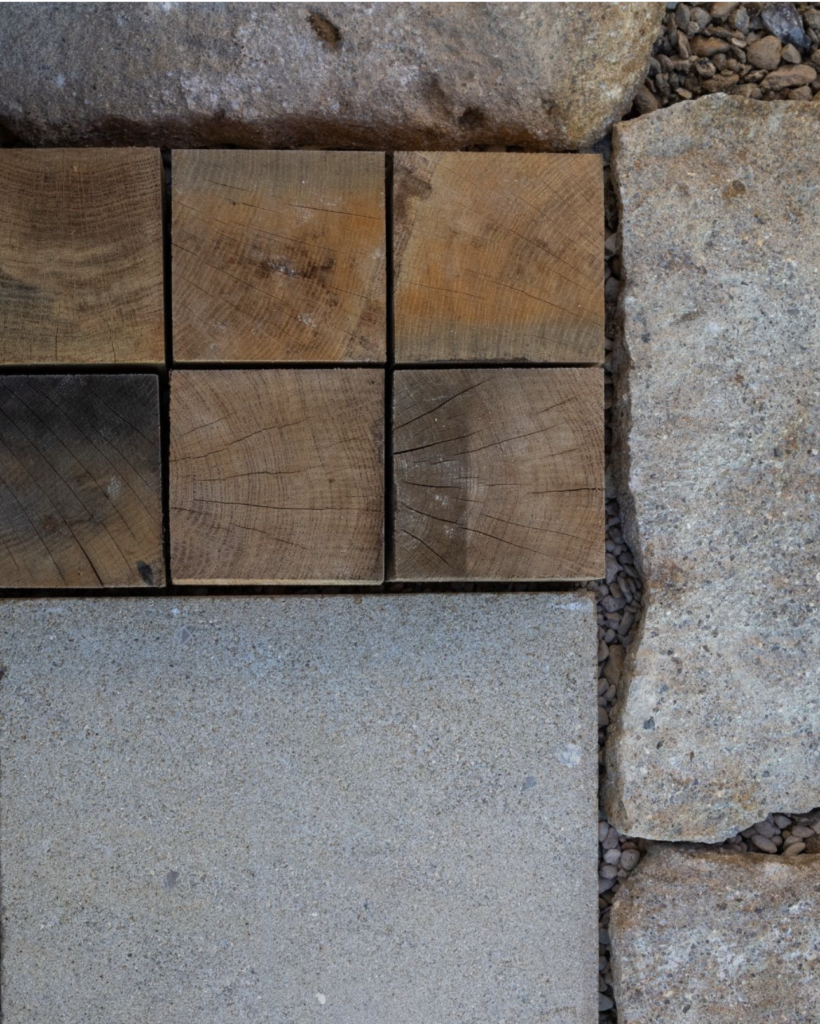
Finishes explained: smooth, textured, tumbled, and riven
The finish affects both the look and the feel underfoot.
Smooth finish
Clean, crisp, contemporary
Often used in porcelain and modern schemes
Best for: minimalist spaces and sharper architecture
Textured finish
Gives more grip and a softer visual feel
Useful in family gardens and areas that get wet or shaded
Best for: practical, everyday use with a natural look
Tumbled finish
Softer edges and a more aged appearance
Helps new paving feel more settled from day one
Best for: traditional homes and gardens that need warmth
Riven or naturally split finish
More variation and texture
Often associated with natural stone
Best for: informal gardens and a more organic look
How to stop a patio looking too busy
This usually happens when too many design decisions compete at once.
A patio can start to feel cluttered when you combine:
A calmer approach usually works better:
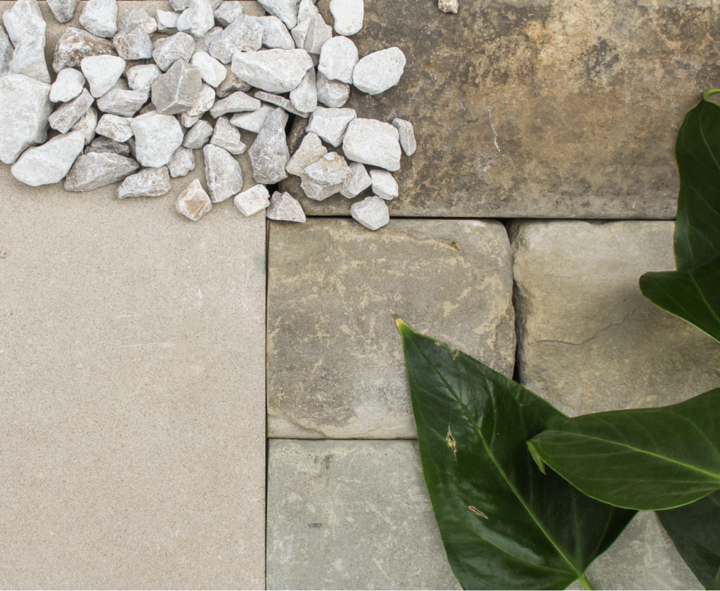
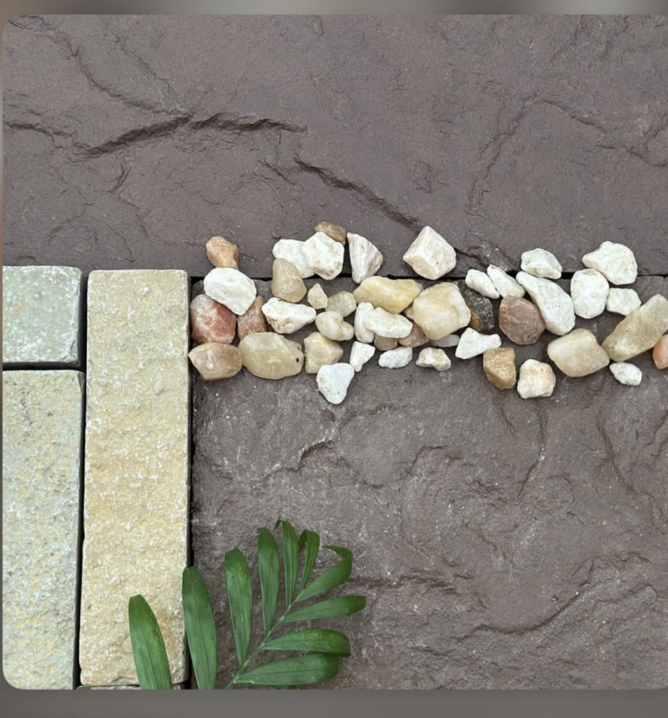
Joint colour matters more than most people realise
Jointing can either pull the patio together or make every slab stand out too sharply.
As a rule:
A softer, blended joint colour usually feels more natural
A high-contrast joint creates a more graphic, modern look
If you’re worried about a patio looking too new or too hard, avoid very stark contrast unless the whole scheme is deliberately contemporary.
Small garden vs large garden: choosing for scale
In smaller gardens
Mid-light tones often help the space feel more open
Simpler patterns usually look calmer
Avoid too many cuts, borders, or competing features
In larger gardens
You can use deeper tones more comfortably
Larger-format paving can feel elegant and spacious
Stronger contrast can work if the rest of the scheme is restrained
Our practical take
If you want a patio that still feels right in five years, don’t chase a trend from a small sample board.